An ingenious vintage German cycle map.
We cycled the Swiss part of the Rhine Cycleway last week, with our folding bikes neatly stowed in suitcases for the flight. A combination of cycle.travel (natch), the Cicerone guide, and the excellent MapOut app guided us safely along the way: a very modern combination of mapping styles.
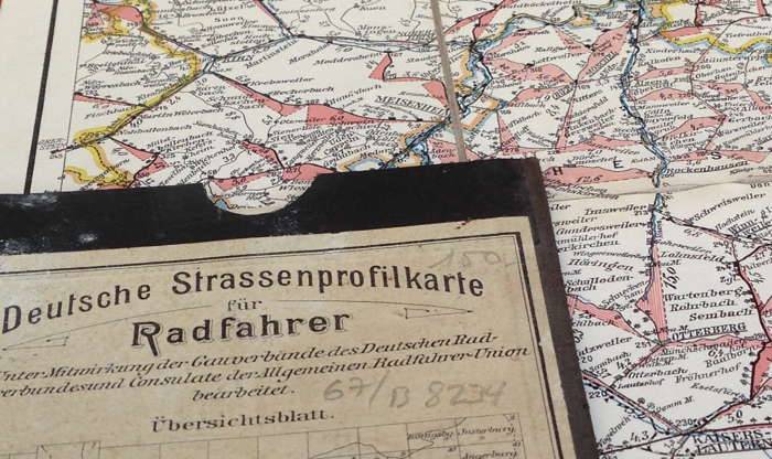
Wandering around Zürich, waiting for our flight home, I was intrigued by this cycle map in the window of a (closed) antiquarian bookstore:

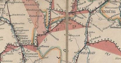
And if that isn’t clear enough from the pic snatched through a window, here’s a better excerpt from an example I found online:

On major climbs, rather than strictly following the two-dimensional curves of the route as a conventional map would do, the map shows a miniature gradient profile for that particular hill.
Bending geometry to show a subjective view of space is nothing unusual. The Tube map (and its many imitators) famously do it, as do the one-dimensional strip maps that Laurence Penney has lovingly curated (and, indeed, one of Laurence’s maps has a passing resemblance to these German sheets). But I’ve never seen quite this approach taken before. It’s a recognition that – just as distance is immaterial to the Tube passenger – to the cyclist, hills are as much part of the ‘distance travelled’ as are the ticking miles on the cycle computer.
Not that the Radfahrer in question would have had cycle computers, of course. There appear to have been 80 of these sheets, published by Mittelbach's Verlag of Leipzig with the co-operation and support of the national German cycling organisations (unter Mitwirkung der Gauverbände des Deutschen Radfahrerbundes und der Konsulate der Allgemeinen Radfahrer-Union). They seem to date from the beginning of the 20th century, and are not yet collectable, if the prices on Abebooks are anything to go by.
And in one of those curious coincidences…
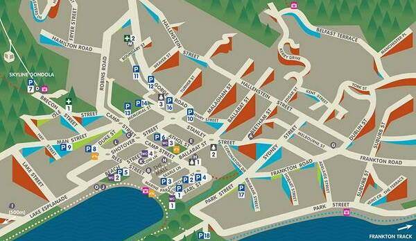
I originally finished this post with “I don’t expect to see a revival any day soon”, but the day after I posted this, Sustrans Midlands retweeted a link to exactly such a map. This ‘Accessible Map’ of Queenstown, New Zealand, was particularly intended for wheelchair users and other people who find steep slopes challenging:

You can download the full map as a PDF from drcqueenstown.co.nz. The cartographer, Toby Eglesfield, has also written an extensive, well-illustrated blog post explaining the design choices he made – and in the comments, two people raise the idea of generating such a map from OpenStreetMap data. Now wouldn’t that be an interesting challenge…
Posted on Tuesday 5 August 2014. Link.