The great lost map scale.
Walk into any map shop in Britain - even if it's just a humble branch of WH Smiths - and you'll find a shelf full of cheap road atlases, each at 1:250,000 or thereabouts. You'll find a selection of the classic OS Landranger at 1:50,000, the successor to the old "one-inch" map, and probably a slightly smaller collection of OS Explorer maps at 1:25,000.
But you're unlikely to find anything at 1:100,000. The scale has almost disappeared entirely from printed maps in Britain.
Its pre-metrication equivalent, the "half-inch" map (1:126,720), was once nearly as popular as the one-inch map. The Ordnance Survey formerly offered complete half-inch coverage of England and Wales, but the real masters of the art were Bartholomews. Their (newly metricated) series faded out in the '70s and '80s, but even today, it's such a commonplace in second-hand bookshops that you can usually pick up sheets for £1 each or less.
I have a real weakness for 1:100,000 maps. Partly it's because, for a cyclist, they're so much more practical. 1:25,000s are way too bulky for anything but the shortest ride, and let's not get into the Ordnance Survey's double-sided printing. 1:50,000s are ok for an afternoon ride if the sheetlines are favourable, but on any longer tour, you'll be filling your panniers up with them. (I think I gave up after trying to bundle seven Landrangers into a knackered old pannier for Lon Las Cymru.)
1:100,000s, however, give you the lie of the land - the woods, the contours, the rivers, the villages - in a fraction of the space. In a convincing (but sadly paywalled) article, Richard Oliver, historian of the 20th century Ordnance Survey, persuasively argues that 1:100,000-1:125,000 is the ideal scale for cycle touring. As a cyclist, I agree entirely.
And as a cartographer, I love the challenge. Any idiot, frankly, can draw a usable large-scale map. The real skill is in getting the information across in a small space... while still creating a beautiful map, one that communicates the lie of the land evocatively as only a good map can. The Landranger series, surely the world's greatest mass-market map, achieves wonders at 1:50,000 - but for a fairly ill-defined audience: walkers need 1:25,000, while motorists are happy with large-scale road atlases (or, increasingly, print-outs from the My First Cartography exercises of popular web mapping sites).
Specialist maps
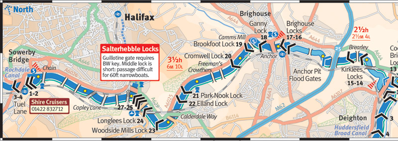
There's much more potential in designing something with a clear audience in mind. So my series of cruising guide maps for Waterways World (which has now grown to cover the entire canal network) has generally been at around 1:100,000. I certainly won't claim it's flawless - the monthly deadlines and the small budgets of a specialist magazine preclude that. But I hope it's clear and effective.
Sustrans' route maps, as drawn by Stirling Surveys, are also 1:100,000 maps of a linear route, prioritising the immediate surroundings of the route while spending less time on the further-flung corners. Rightly lauded, they clearly take a lot of time to draw, and I'm sad but not entirely surprised that Sustrans has been using less elaborate cartography from Four Point Mapping (ex-Cycle City Guides) of late.
So let's take a look at some older 1:100,000 maps, because we can.
Ordnance Survey Half-Inch Road Map
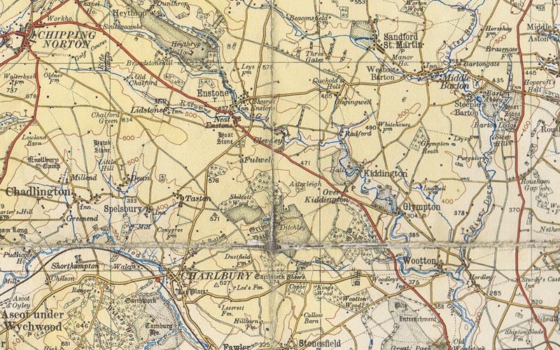
This first example is from the Ordnance Survey Road Map of Oxford and Swindon (half-inch to the mile). The series was essentially completed in 1912-1915 though this edition is from 1927. Map dealer Forbes Robertson calls it "one of the most beautiful editions produced by the OS", and I can't argue with that.
Note not only the stipples for the great estates of Ditchley, Heythrop, Cornbury and Kiddington, but the elaborate handiwork for woodlands. Hill shading is discreet but highly effective: the Evenlode valley really stands out from the higher land around Chipping Norton. The colour palette is commendably restrained and something that many modern cartographers could learn from.
Ordnance Survey Special District Map
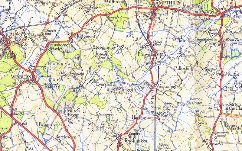
Moving on, this "Special District (RELIEF) Map" of Greater London dates from 1935 and was one of a very small series produced at the time (Birmingham, the Peak District, and the Cotswolds were the only other areas to be included).
The relief shading is rather peculiar, with a gentle orange wash bearing little relation to the contour lines, which almost look like they're out of register. The colours are more strident, but still chosen from a small palette. The typography is remarkably elegant - from the all-caps names such as Ampthill and Woburn, down to the tiny italics for railway station names (top left). It's a map where the whole is greater than the sum of its parts.
Ordnance Survey Half-Inch Map of Snowdonia
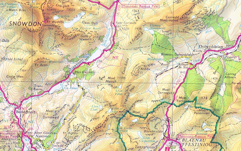
This map of Snowdonia is pretty much the last half-inch map the Ordnance Survey ever produced, a lone survivor which struggled on into the 1980s. (I'm trying to forget the unforgivable 1990s Tour series, noddy road-atlas cartography blown up to 1:100,000 in the colour photocopier, and a blemish on the reputation of the world's finest national mapping agency.)
The relief shading is really quite startling, even conceding that my scanner has picked out the colours more vividly than the original. Yet the design is a clear descendant of the 1920s series and retains its simplicity and immediacy; there's no long catalogue of colours and typefaces, just one, consistent design. I particularly like the "Mountain Rescue Post" labelling: why design an obscure symbol for a rarely-used feature when you can simply label it textually.
Bartholomews Half-Inch Series
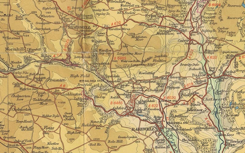
This Bartholomews half-inch map of the Peak District claims to have been published in 1946, but it doesn't really matter; the cartography didn't change that much over the 20th century. It's not dissimilar to the 1920s OS Road Map shown above, especially in its rather subdued style - something that must have seemed an anachronism in the 1970s as the gaudy road-atlas cartography of George Philip and the RAC was becoming the standard.
These maps were endorsed and (in an early precursor of OSM?) corrected by Cyclists' Touring Club members, and you can understand why: roads and contours are absolutely dominant here, with the odd spot-height, railway station, and helpful annotation of "Inn". What more does the cyclist need?
AA Close-Up Atlas
But the art of the 1:100,000 map is not completely dead. This is a scan from the contemporary AA Close-Up Atlas, one of two massive road atlases (the other being the Philip's Navigator) to provide national coverage at this scale.
Some people are rather sniffy about the AA's cartography, but I'm a fan. The typography and palette are well chosen. I very much like the way that residential roads are shown, but uncased. And there's a willingness not to simply copy what everyone else is doing. Look at the datasets incorporated into this example: pubs from the Good Pub Guide, petrol stations and speed cameras, names for country lanes, and best of all, the National Cycle Network. (Yep - that dotted green line is National Route 57.)
It's not quite suitable for cycling. The hill-shading is a barely discernible grey wash rather than actual contours that might tell you what lies in wait, and, well, the book is both rather heavy and too expensive for you to tear up happily. But it's close.
I don't hold out any great hopes for a revival in 1:100,000 printed mapping. But whenever I encounter a new mapping site, I take a while to look around zoom levels 12 and 13. One day, I hope, I'll encounter something as fine as these earlier examples.
Posted on Wednesday 6 March 2013. Link.